Initials
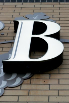
I chose this picture because I like the overall font of the sign that the letter was originally from. Its nice and clear and I liked the contrast between the white and black in the letter.
To edit this picture I just fixed the angle of the camera, cropped out the unnecessary parts in the picture to put more focus on the main letter I was trying to get.
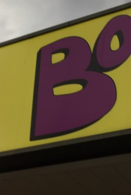
I chose this picture because I think the font of the letter gives it some personality because its a little more unique then other signs and the colour choice gives it a little more "woah" to it.
I didn't do much to edit it because I didn't want it to look to unrealistic. All I did was edit the brightness to make it a bit more clear.
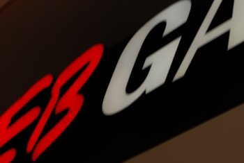
I chose this picture because I thought it was cool that it was both of my initials side by side. The lights from the sign give it a glowing look which I thought was cool but I do wish it came a little more clear.
Patterns
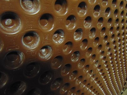
I chose this picture because I thought it was cool that there was two different patterns happening depending on the way you look at it. Theres the pattern of the circles and then the circles are forming lines going down on an angle giving it a cool effect.
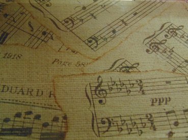
I liked this pattern because it's kind of an organized mess happening with the lines and the music notes give it personality.
To edit this picture all i did was darken the contrast to highlight the detail.
To edit this picture all i did was darken the contrast to highlight the detail.
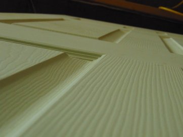
I chose this picture because I liked how the lines on the door give it a rising kind of feeling because of the angle that the photo was taken at, It's almost the same as if you were to stand next to a building and look straight up.
Hands
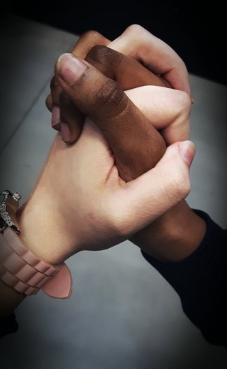
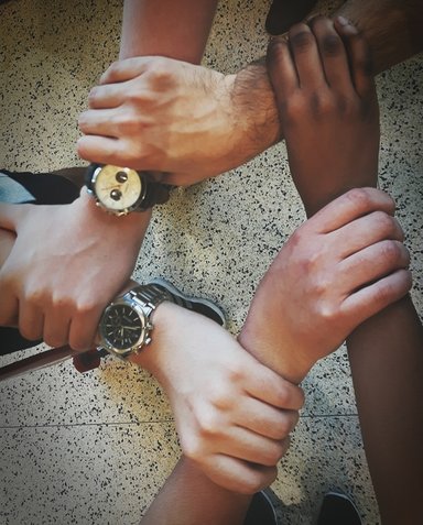
I chose this picture because it's a simple picture but it has a very powerful meaning. Through this picture it shows Diversity and Equality which I believe is very important in this generation with all the hate and violence happening all over the world.
To edit this picture I just lowered the contrast and added a vignette to single out the hands and to distract from things on the arms like the sleeve and the watch.
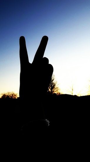
I chose this picture because its a very simple picture but has a straight forward meaning. The sunset in the background really has a peaceful mood to it which goes along with the silhouette of the hand.
To edit this photo I just brightened it slightly to add more colour to the sky in the background and making the hand a more clean, noticeable figure.
Whether you are black or white, gay or straight, short or tall, or male or female we are all equal. We need to accept each other as human beings no matter our differences we need to love and support one another. Which is why I chose this photo because I think that really shows in this photo.
To edit this picture I cropped out the things that distracted from the main point of this photo and added a vignette to single out the hands.
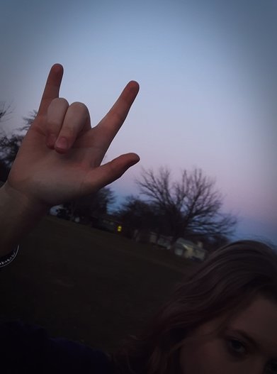
I chose this photo because I liked how you could see the girls (McKayla Heath) face but it doesn't really distract from the hand in the picture.
To edit this picture all I did was crop the picture then add a vignette to give it a darker look around the edges.
Camera Simulator
Greater Depth of fieldTo get a greater depth of field you need to decrease the size of the aperture on your camera. For greater depth of field you have to have a slower shutter speed then you do for Shallow depth.
|
Shallow Depth of fieldTo get Shallow depth of field you need to have a larger aperture and a faster shutter speed. You need to have the faster shutter speed because the aperture is bigger and there will be a lot of light coming into the photo.
|
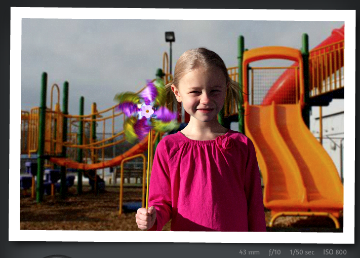
Motion Blur |
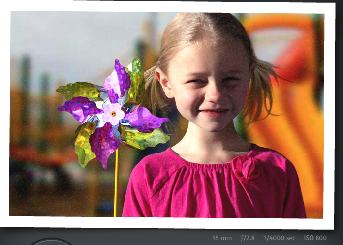
Motion Freeze |
|
Motion Blur happens when you have a slow shutter
speed and you are taking a picture of a fast moving object, causing the thing thats going fast to look blurry and the rest of the photo being somewhat clear. |
Motion Freeze happens when you have a fast shutter speed while taking a picture of a fast moving object. This allows the whole picture to turn out clear.
|
Detail Assignment
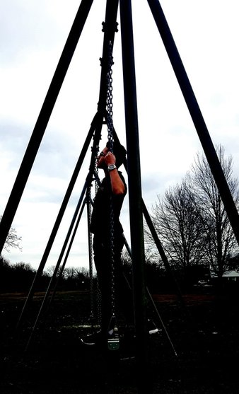
I chose this picture because the way the bars of the swings frame the main subject of the picture. I also like how you can see the shape of his face but can't see fine details so it gives the picture a kind of mysterious look to it.
To edit this picture I just cropped distracting parts out of the picture and lowered the contrast to highlight the details in the background. |
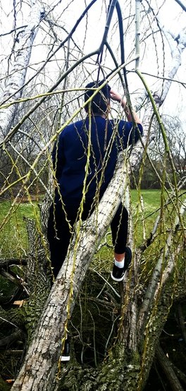
I chose this picture because I liked how it makes you a little bit curious and ask questions like "What is he looking at?" "What is he thinking about?"
I also like the way how he stands out from the rest of the tree. To edit this picture I didn't really have to do a lot except adjust the brightness and crop it. |
Shoes
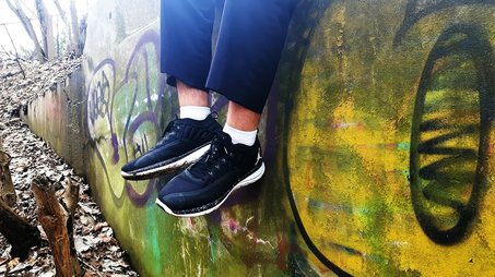
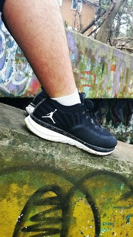
I chose these 2 pictures because I like how that background details make the shoes stand out more and give it a little more character.
To edit these photos I just adjusted the contrast to make the background colours stand out more.
To edit these photos I just adjusted the contrast to make the background colours stand out more.
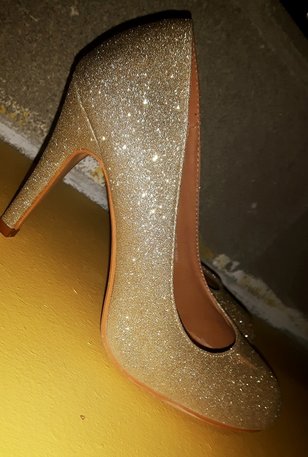
I chose this picture because I honestly loved how much the sparkles on the shoe stands out in the photo and gives the photo more character and its cool to look at.
To edit this photo I first cropped the picture and adjusted the contrast to focus more on the shoe.
To edit this photo I first cropped the picture and adjusted the contrast to focus more on the shoe.
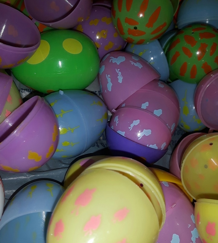
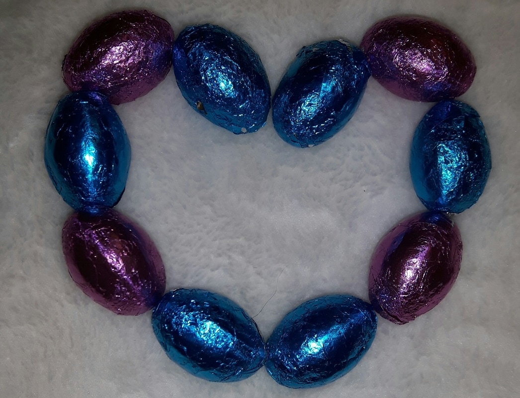
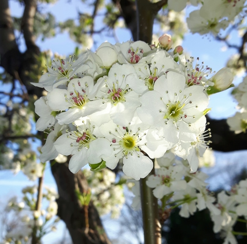
Easter
|
|
|
I didn't really do much over the easter weekend because my siblings were at my fathers house and I was working all weekend, but these are a few picture I was able to take that I think captures the colourful, spring time feel of Easter.
